
the numbers that matter, on one screen
a single page for decision-makers: the key figures up top, the trend underneath, and a breakdown alongside.
 kpis tracked at a glance
- trend and breakdown side by side
- clear, uncluttered layout

portfolio
I design interactive power bi dashboards that deliver real-time insights. they track kpis, visualise trends and help decision-makers understand performance quickly.
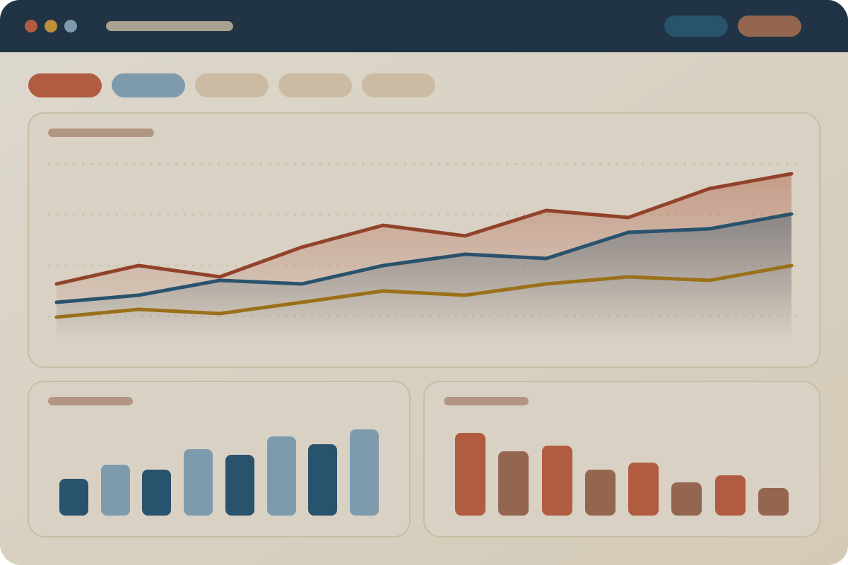
 interactive power bi
featured dashboard work
choose a view to see what a dashboard like this helps you do.
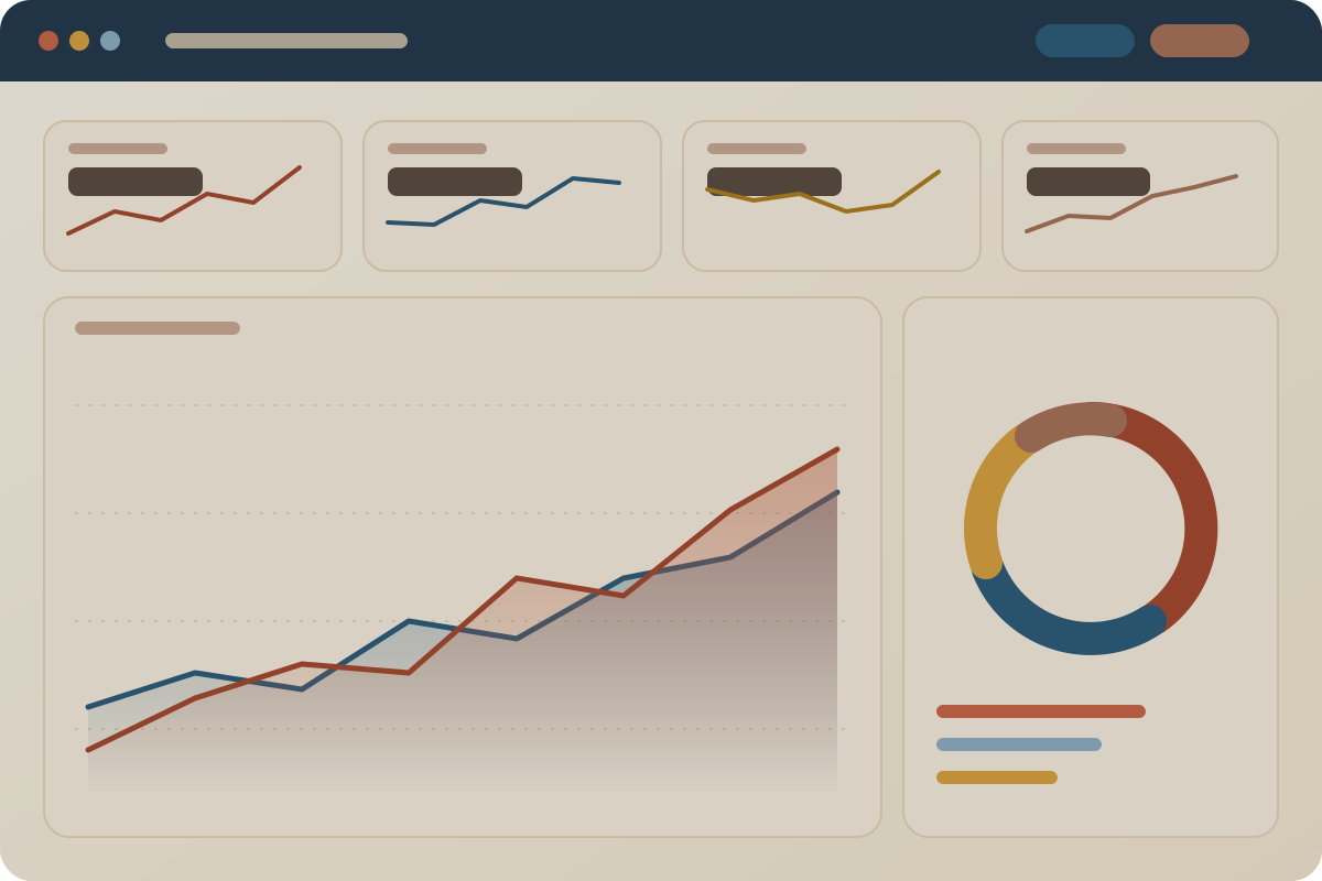
a single page for decision-makers: the key figures up top, the trend underneath, and a breakdown alongside.
kpis tracked at a glancetrend and breakdown side by sideclear, uncluttered layoutfollow performance over time and compare periods, with filters that let each person look at what matters to them.
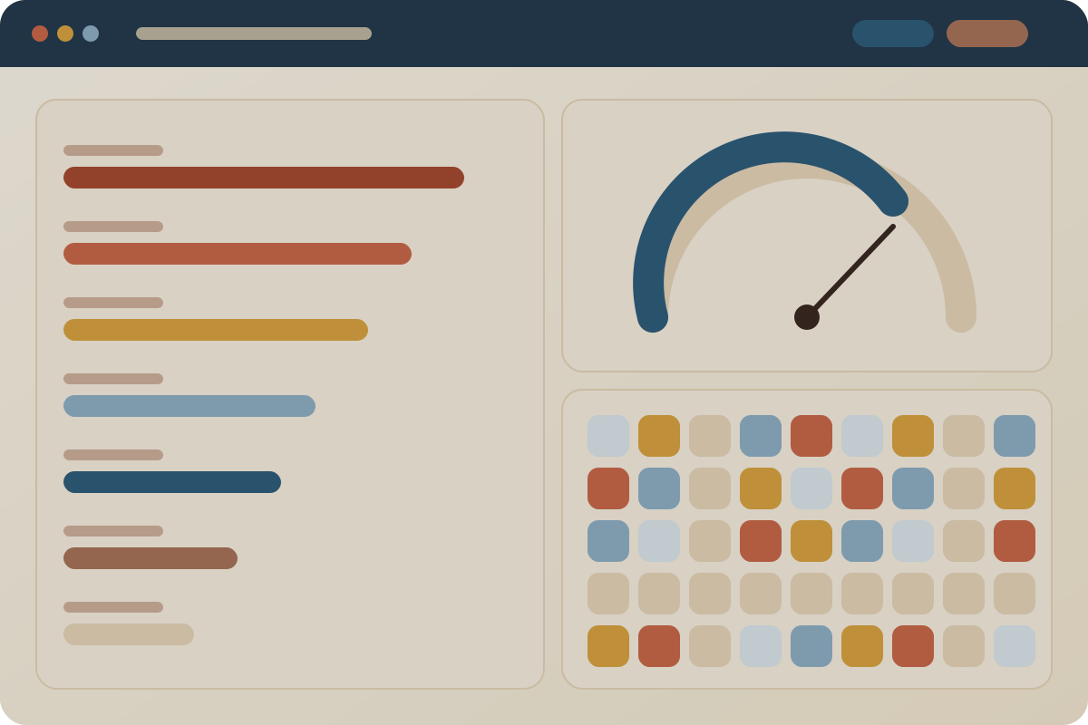
trends made easy to readcompare periods and categoriesinteractive filtersrank products, lines or teams, check progress towards a target, and spot where attention is needed.
rankings and targets togetherquick visual scanningbuilt for fast decisionsillustrative dashboard layouts. real project screens will appear here.
selected projects
a few projects that show how I work, from the question to the finished result. where it is shareable, the repository is linked so you can look at the code yourself.
only anonymised, synthetic or public data is shown here. client work stays confidential.
what every dashboard includes
the figures that matter most, always in view.
patterns over time made simple to read.
interactive views that keep decision-makers informed.
clean design so anyone on the team can use it quickly.
free consultation
message me on whatsapp and tell me what you would like to track. the first consultation is free.
 chat with me on whatsapp
not ready to chat? send me an email instead.